黑松山资源网 Design By www.paidiu.com


<!DOCTYPE html>
<html lang="en">
<head>
<meta charset="UTF-8">
<title>audio</title>
</head>
<body>
<audio controls="controls">
<source src="video/Light.mp3" type="audio/mpeg">
<source src="video/Light.ogg" type="audio/ogg">
您的浏览器太low了
</audio>
<video controls muted poster="img/1.png" width="300px" height="300px">
<source src="video/Light.mp3" type="video/mp3">
<source src="video/Light.mp3" type="video/ogg">
您的浏览器太low
</video>
<form action="">
<ol>
<li>邮箱:<input type="email"></li>
<li>网址:<input type="url"></li>
<li>日期:<input type="date"></li>
<li>数量:<input type="number"></li>
<li>日期:<input type="time"></li>
<li>手机号:<input type="tel"></li>
<li>搜索:<input type="search"></li>
<li>颜色:<input type="color"></li>
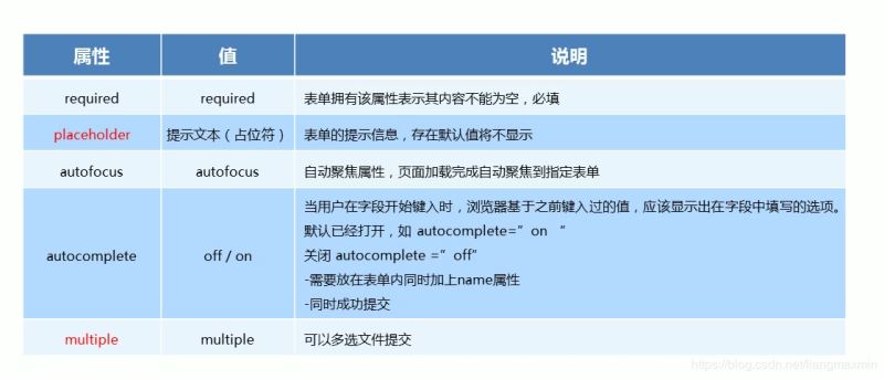
<li>不能为空:<input type="text" required="required"></li>
<li>提示为本:<input type="text" placeholder="啦啦啦 我是卖报的"></li>
<li>自动获得鼠标焦点:<input type="text" autofocus="autofocus"></li>
<li><input type="text" autocomplete="on" name="autocomplete"></li>
<li><input type="submit" value="提交"></li>
</ol>
<hr>
</form>
<form action="">
<ul>
<li><input type="file" name="" id="" multiple></li>
<li><input type="submit" value="提交"></li>
</ul>
</form>
</body>
</html>


<!DOCTYPE html>
<html lang="en">
<head>
    <meta charset="UTF-8">
    <title>css3</title>
</head>
<style>
    ul li:nth-child(odd) {
        background-color: cornflowerblue;
    }

    ul {
        display: inline-grid;
        width: 200px;
        margin-left: -39px;
        list-style: none;
        text-align: center;
    }

    div::before {
        display: inline-block;
        content: "我想";
        width: 100px;
        height: 100px;
        background-color: pink;
    }

    div::after {
        display: inline-block;
        content: "飞的更高";
        width: 100px;
        height: 100px;
        background-color: pink;
    }
</style>
<body>
<div>
    <ul>
        <li>1</li>
        <li>4</li>
        <li>4</li>
        <li>4</li>
        <li>4</li>
    </ul>
</div>
</body>
</html>


<!DOCTYPE html>
<html lang="en">
<head>
<meta charset="UTF-8">
<title>动画</title>
</head>
<style>
/*from 和 to 等价于 0% 和 100%*/
/*@keyframes move {*/
/*0%{*/
/*transform:translateX(0px);*/
/*}*/
/*100%{*/
/*transform:translateX(1000px);*/
/*}*/
/*}*/
.bowen {
position: fixed;
top: 50%;
left: 50%;
width: 200px;
height: 200px;
transform: translate(-50%, -50%);
background-color: pink;
}
.bowen div[class^="dotted"] {
position: absolute;
top: 50%;
left: 50%;
width: 8px;
height: 8px;
transform: translate(-50%, -50%);
background-color: deepskyblue;
border-radius: 50%;
}
@keyframes pulse {
0% {
}
70% {
width: 100px;
height: 100px;
opacity: 1;
}
100% {
width: 100px;
height: 100px;
opacity: 0;
}
}
.bowen div.dotted2,
.bowen div.dotted3,
.bowen div.dotted4 {
background-color: transparent;
box-shadow: 0 0 8px deepskyblue;
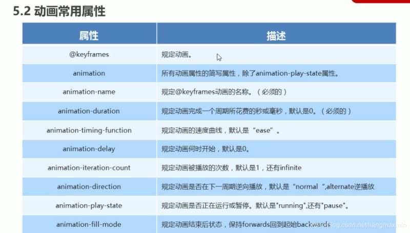
animation: pulse 1.2s linear infinite forwards;
}
.bowen div.dotted2 {
animation-delay: 0.4s;
}
.bowen div.dotted3 {
animation-delay: 0.8s;
}
</style>
<body>
<div class="bowen">
<div class="dotted1"></div>
<div class="dotted2"></div>
<div class="dotted3"></div>
<div class="dotted4"></div>
</div>
</body>
</html>


<!DOCTYPE html>
<html lang="en">
<head>
    <meta charset="UTF-8">
    <title>3D</title>
</head>

<style>
    body {
        perspective: 500px;
    }

    .box {
        position: relative;
        width: 200px;
        height: 200px;
        margin: 0 auto;
        transform-style: preserve-3d;
        transition: all .3s;
    }

    .box div {
        position: absolute;
        top: 0;
        left: 0;
        width: 100%;
        height: 100%;
        background-color: cornflowerblue;
    }

    .box div:last-child {
        background-color: aliceblue;
        transform: rotateX(60deg);
    }

    .box:hover {
        transform: rotate3D(0, 1, 0, 60deg);
    }

</style>

<body>
<div class="box">
    <div></div>
    <div></div>
</div>
</body>
</html>

<!DOCTYPE html>
<html lang="en">
<head>
    <meta charset="UTF-8">
    <title>导航栏</title>
</head>
<style>

    li {
        float: left;
        padding: 0 10px;
        list-style: none;
        perspective: 500px;
    }

    .box {
        position: relative;
        width: 200px;
        height: 50px;
        transform-style: preserve-3d;
        transition: all .5s;
    }

    .box div {
        position: absolute;
        top: 0;
        left: 0;
        width: 100%;
        height: 100%;
        background-color: pink;
        text-align: center;
        line-height: 50px;
    }

    .box div:nth-child(1) {
        transform: translateZ(25px);
    }

    .box div:nth-child(2) {
        background-color: purple;
        /*必须先移动后旋转*/
        transform: translateY(25px) rotateX(-90deg);

    }

    .box:hover {

        transform: rotateX(90deg);

    }


</style>

<body>
<ul>
    <li>
        <div class="box">
            <div>好好学习</div>
            <div>天天向上</div>
        </div>
    </li>
    <li>
        <div class="box">
            <div>好好学习</div>
            <div>天天向上</div>
        </div>
    </li>
    <li>
        <div class="box">
            <div>好好学习</div>
            <div>天天向上</div>
        </div>
    </li>
    <li>
        <div class="box">
            <div>好好学习</div>
            <div>天天向上</div>
        </div>
    </li>

</ul>
</body>
</html>

<!DOCTYPE html>
<html lang="en">
<head>
    <meta charset="UTF-8">
    <title>旋转木马</title>
</head>
<style>
    section {
        position: fixed;
        top: 50%;
        left: 50%;
        width: 300px;
        height: 200px;
        transform: translate(-50%, -50%);
        perspective: 2500px;
    }

    section div.box {
        position: relative;
        transform-style: preserve-3d;
        animation: move 15s linear infinite;
        background: url("img/4.jpg") no-repeat;
        background-size: 300px 200px;
    }

    div {
        position: absolute;
        top: 0;
        left: 0;
        width: 100%;
        height: 100%;
    }

    div:nth-child(1) {
        background: url("img/3.jpg") no-repeat;
        background-size: 300px 200px;
        transform: rotateY(0) translateZ(400px);
    }

    div:nth-child(2) {
        background: url("img/9.jpg") no-repeat;
        background-size: 300px 200px;
        transform: rotateY(60deg) translateZ(400px);
    }

    div:nth-child(3) {
        background: url("img/5.jpg") no-repeat;
        background-size: 300px 200px;
        transform: rotateY(120deg) translateZ(400px);
    }

    div:nth-child(4) {
        background: url("img/6.jpg") no-repeat;
        background-size: 300px 200px;
        transform: rotateY(180deg) translateZ(400px);
    }

    div:nth-child(5) {
        background: url("img/7.jpg") no-repeat;
        background-size: 300px 200px;
        transform: rotateY(240deg) translateZ(400px);
    }

    div:nth-child(6) {
        background: url("img/8.jpg") no-repeat;
        background-size: 300px 200px;
        transform: rotateY(300deg) translateZ(400px);
    }

    @keyframes move {
        0% {
            transform: rotateY(0);
        }
        100% {
            transform: rotateY(360deg);
        }
    }

    .box:hover{
        animation-play-state: paused;
    }


</style>
<body>
<section>
    <div class="box">
        <div></div>
        <div></div>
        <div></div>
        <div></div>
        <div></div>
        <div></div>
    </div>
</section>
</body>
</html>


总结
黑松山资源网 Design By www.paidiu.com
广告合作:本站广告合作请联系QQ:858582 申请时备注:广告合作(否则不回)
免责声明:本站资源来自互联网收集,仅供用于学习和交流,请遵循相关法律法规,本站一切资源不代表本站立场,如有侵权、后门、不妥请联系本站删除!
免责声明:本站资源来自互联网收集,仅供用于学习和交流,请遵循相关法律法规,本站一切资源不代表本站立场,如有侵权、后门、不妥请联系本站删除!
黑松山资源网 Design By www.paidiu.com
暂无评论...
苹果官宣WWDC 2024!预计会有大批AI功能 - 2026/7/18
3月27日消息,苹果宣布2024年全球开发者大会(WWDC)将于6月10日至6月14日举行,巧合的是,这次大会与端午假期重合。
苹果官方表示:
在线参加 Apple 每年规模最大的开发者盛会。亲眼见证 Apple 最新平台、技术和工具的发布。了解如何创建和改进你的 App 和游戏。与 Apple 设计师和工程师互动交流,与全球开发者社区建立联系。以上活动均免费在线举行。
探索各种新的工具、框架和功能,助力你打造出理想的 App 和游戏。通过视频讲座学习新技能,与 Apple 专家进行一对一会面,以推进你的项目,完善你的构思。
Swift Student Challenge 旨在支持和鼓舞下一代开发者、创作者和企业家。太平洋时间 3 月 28 日,我们将公布今年的获奖者名单。获奖者将有资格参加在 Apple Park 举办的特别活动。我们还会选出 50 名杰出获胜者,他们将受邀前往库比提诺,获得为期三天的非凡体验,包括参加 Apple Park 的特别活动。
RTX 5090要首发 性能要翻倍!三星展示GDDR7显存
三星在GTC上展示了专为下一代游戏GPU设计的GDDR7内存。
首次推出的GDDR7内存模块密度为16GB,每个模块容量为2GB。其速度预设为32 Gbps(PAM3),但也可以降至28 Gbps,以提高产量和初始阶段的整体性能和成本效益。
据三星表示,GDDR7内存的能效将提高20%,同时工作电压仅为1.1V,低于标准的1.2V。通过采用更新的封装材料和优化的电路设计,使得在高速运行时的发热量降低,GDDR7的热阻比GDDR6降低了70%。
更新日志
2026年07月18日
2026年07月18日
- 小骆驼-《草原狼2(蓝光CD)》[原抓WAV+CUE]
- 群星《欢迎来到我身边 电影原声专辑》[320K/MP3][105.02MB]
- 群星《欢迎来到我身边 电影原声专辑》[FLAC/分轨][480.9MB]
- 雷婷《梦里蓝天HQⅡ》 2023头版限量编号低速原抓[WAV+CUE][463M]
- 群星《2024好听新歌42》AI调整音效【WAV分轨】
- 王思雨-《思念陪着鸿雁飞》WAV
- 王思雨《喜马拉雅HQ》头版限量编号[WAV+CUE]
- 李健《无时无刻》[WAV+CUE][590M]
- 陈奕迅《酝酿》[WAV分轨][502M]
- 卓依婷《化蝶》2CD[WAV+CUE][1.1G]
- 群星《吉他王(黑胶CD)》[WAV+CUE]
- 齐秦《穿乐(穿越)》[WAV+CUE]
- 发烧珍品《数位CD音响测试-动向效果(九)》【WAV+CUE】
- 邝美云《邝美云精装歌集》[DSF][1.6G]
- 吕方《爱一回伤一回》[WAV+CUE][454M]